
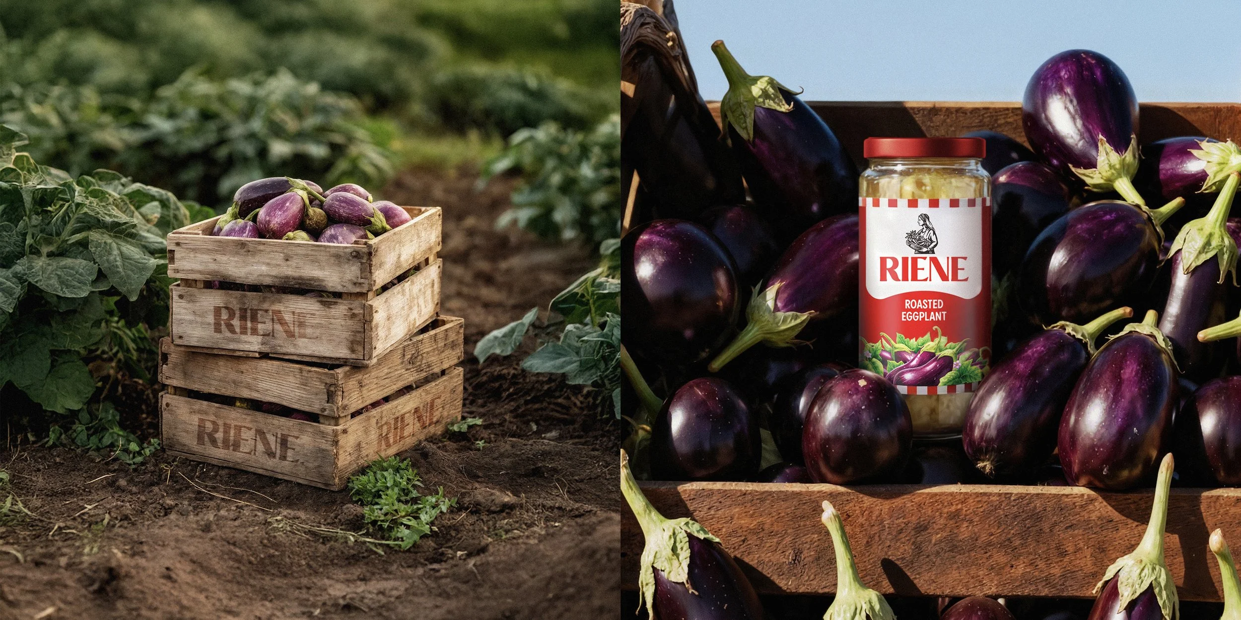

Introducing Riene, a brand born from the soil, crafted with purpose, and designed to bring the warmth of the Aegean to every table.
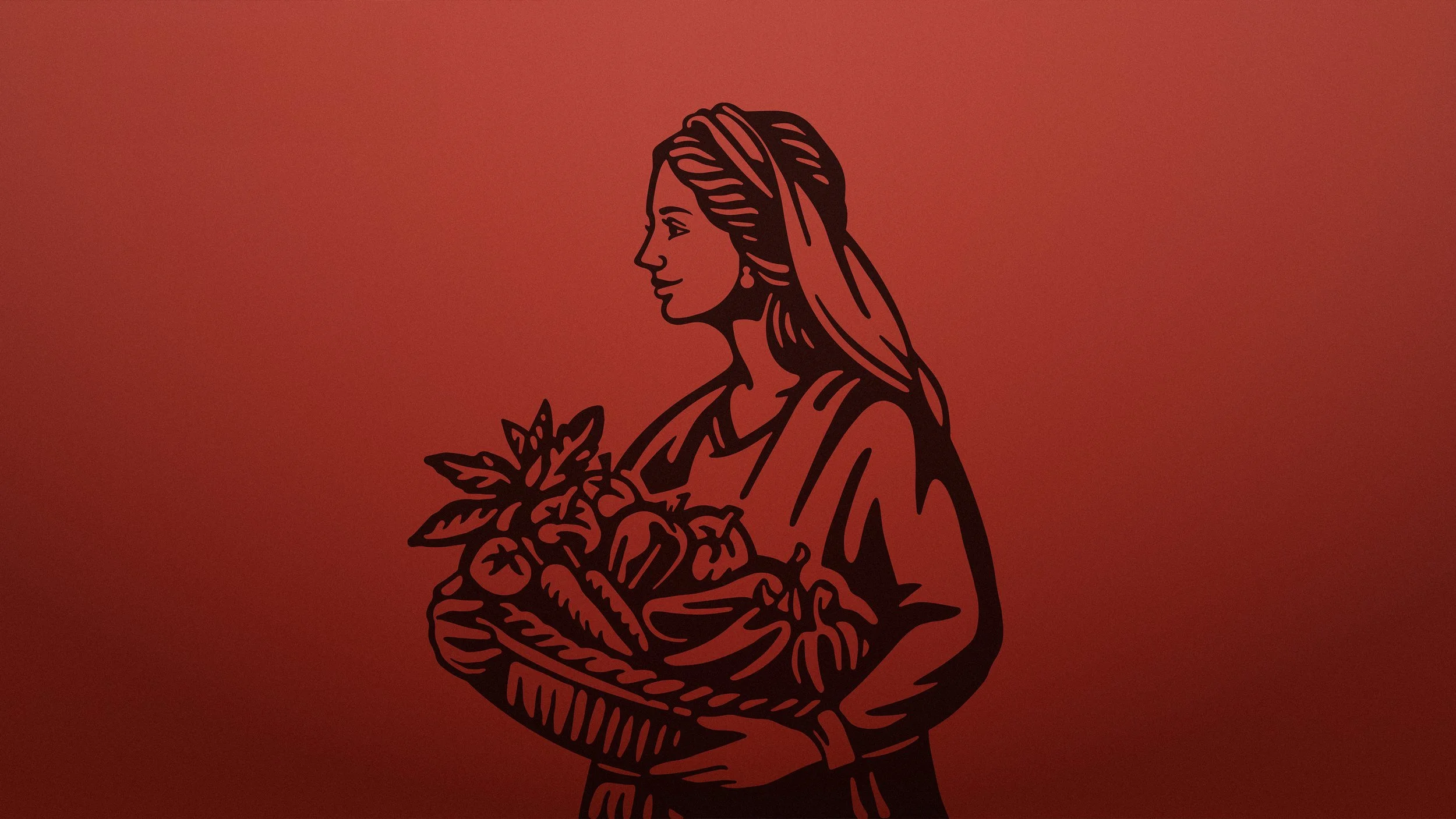
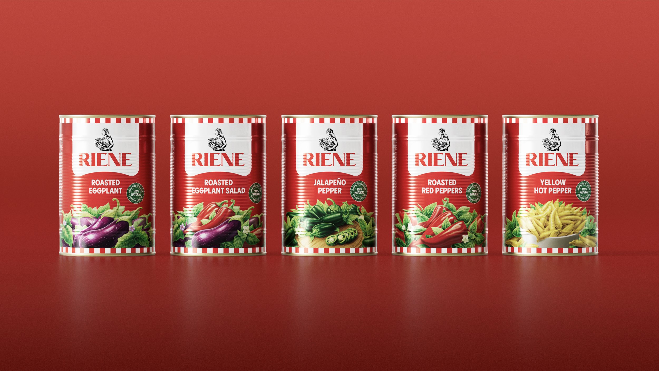
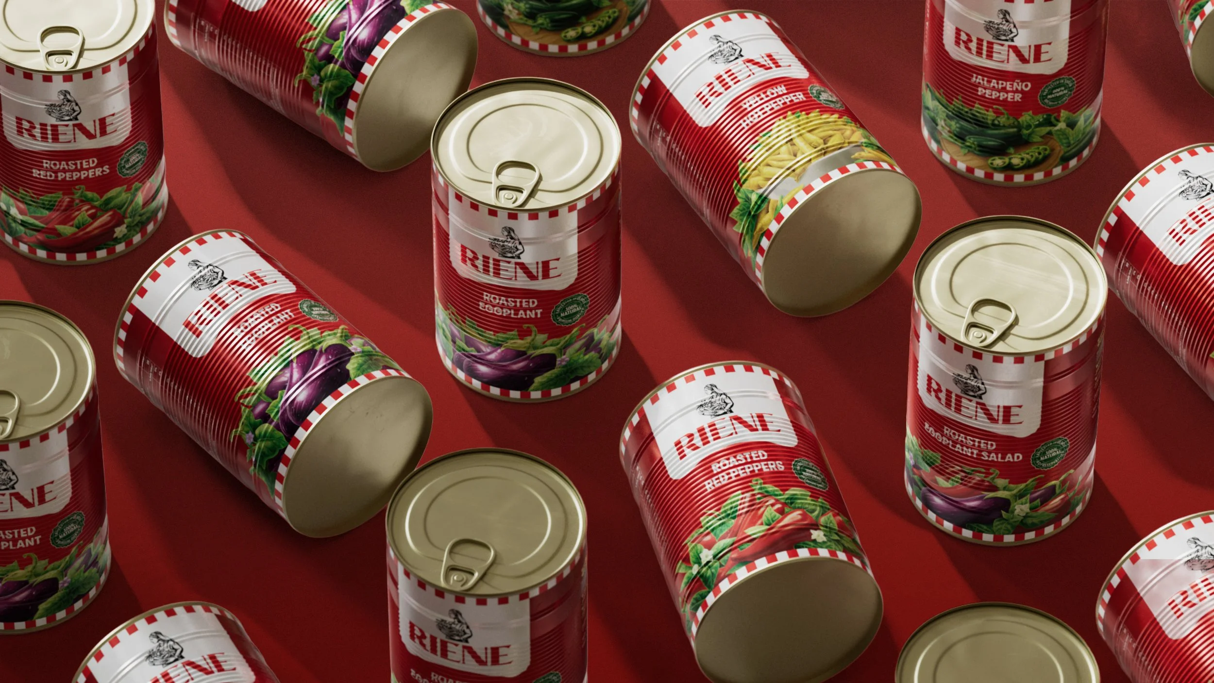
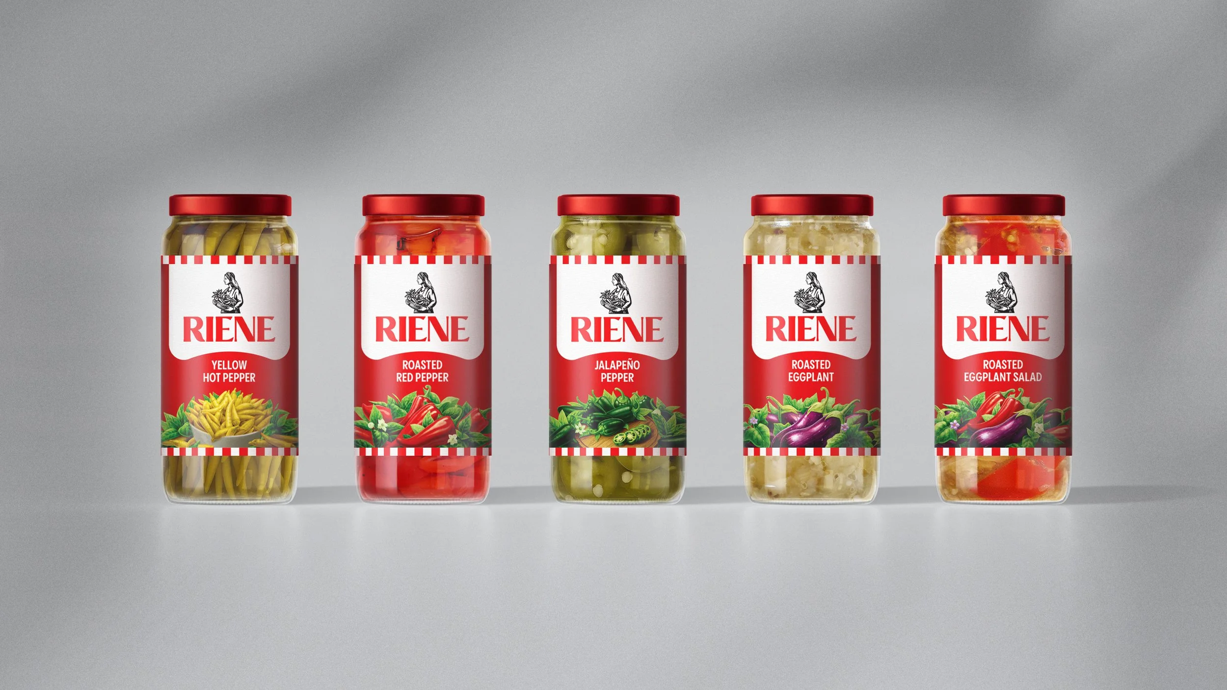
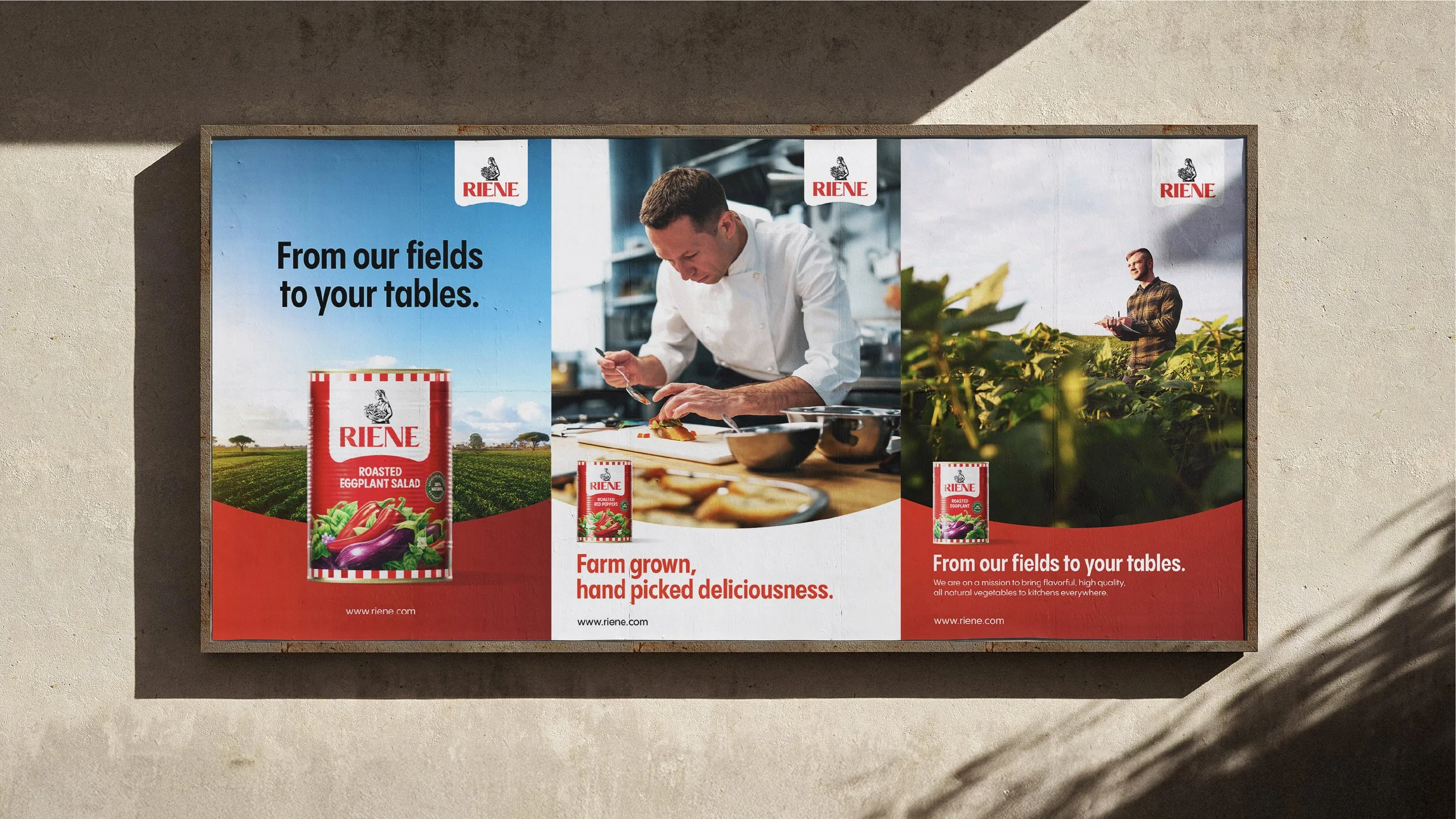
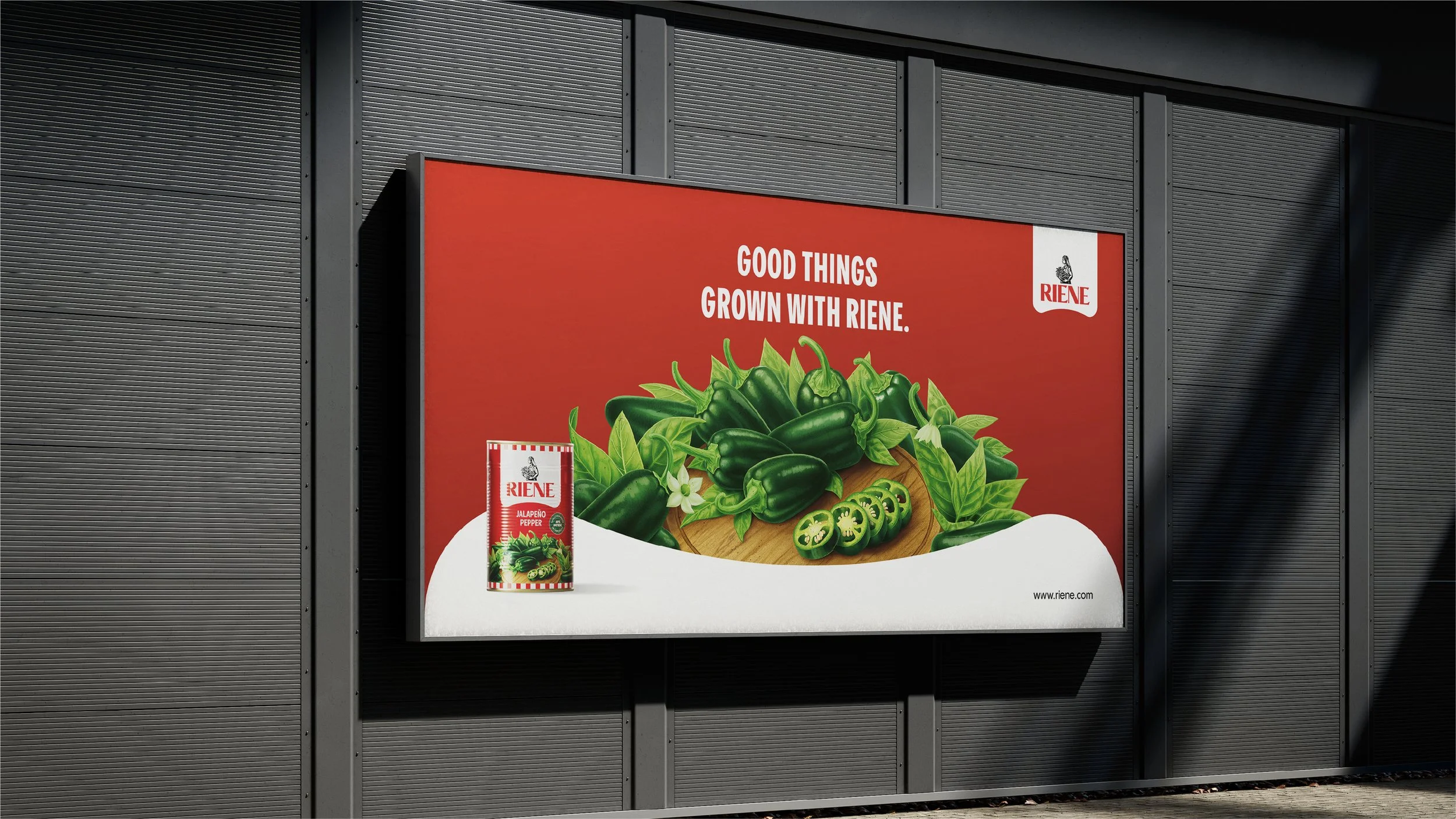
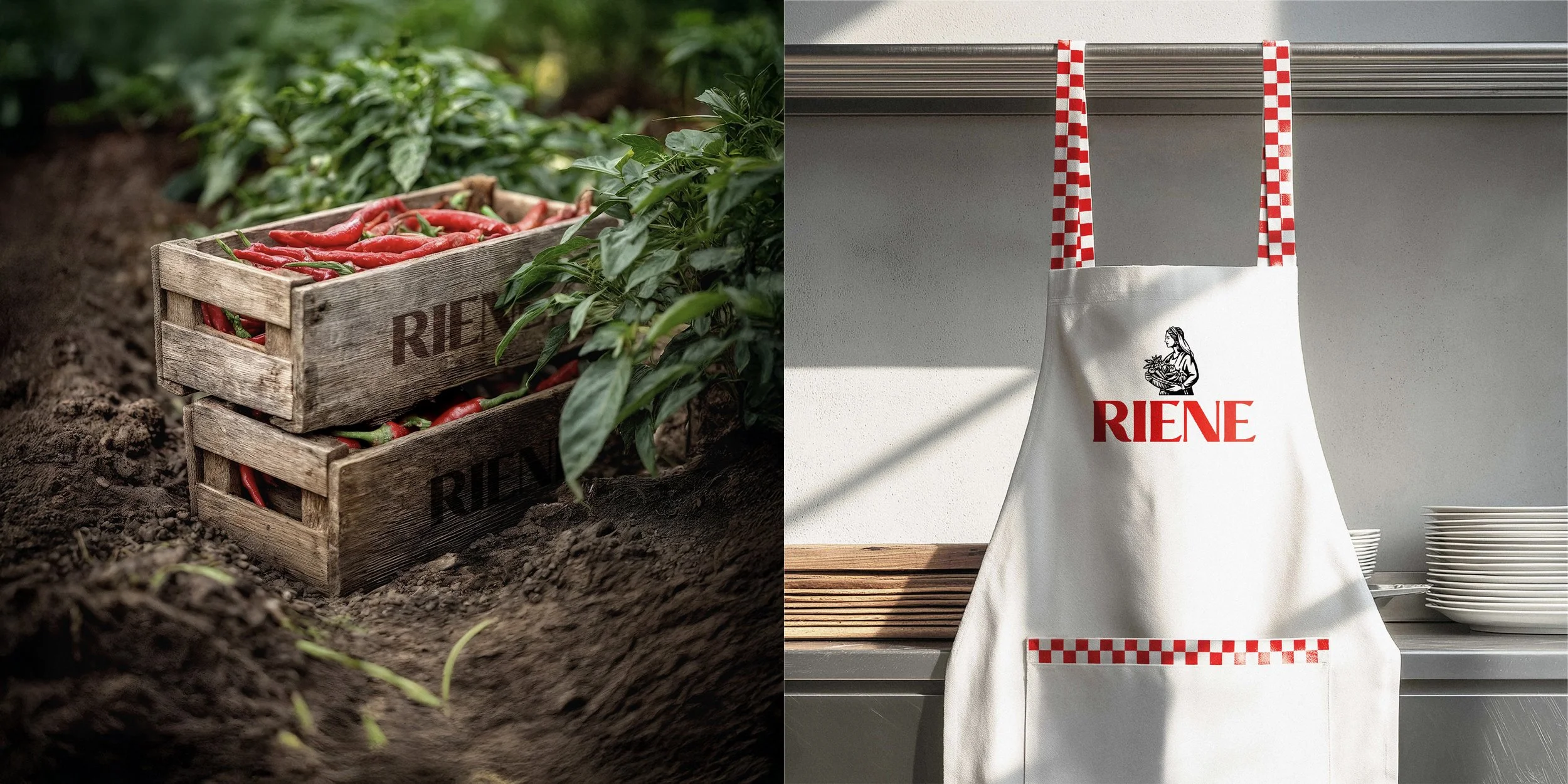
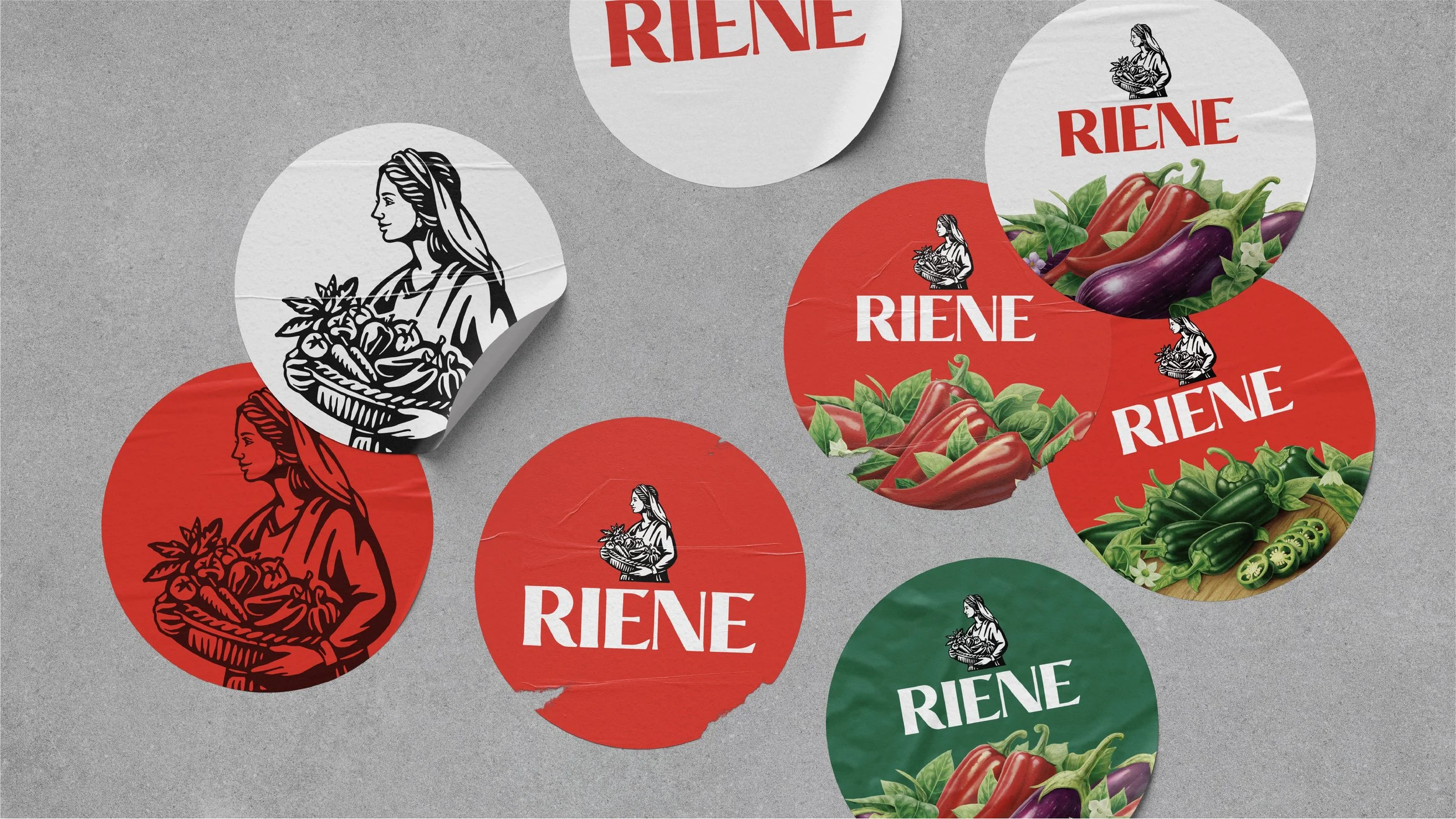
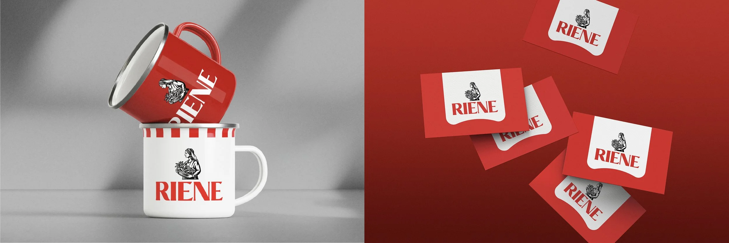
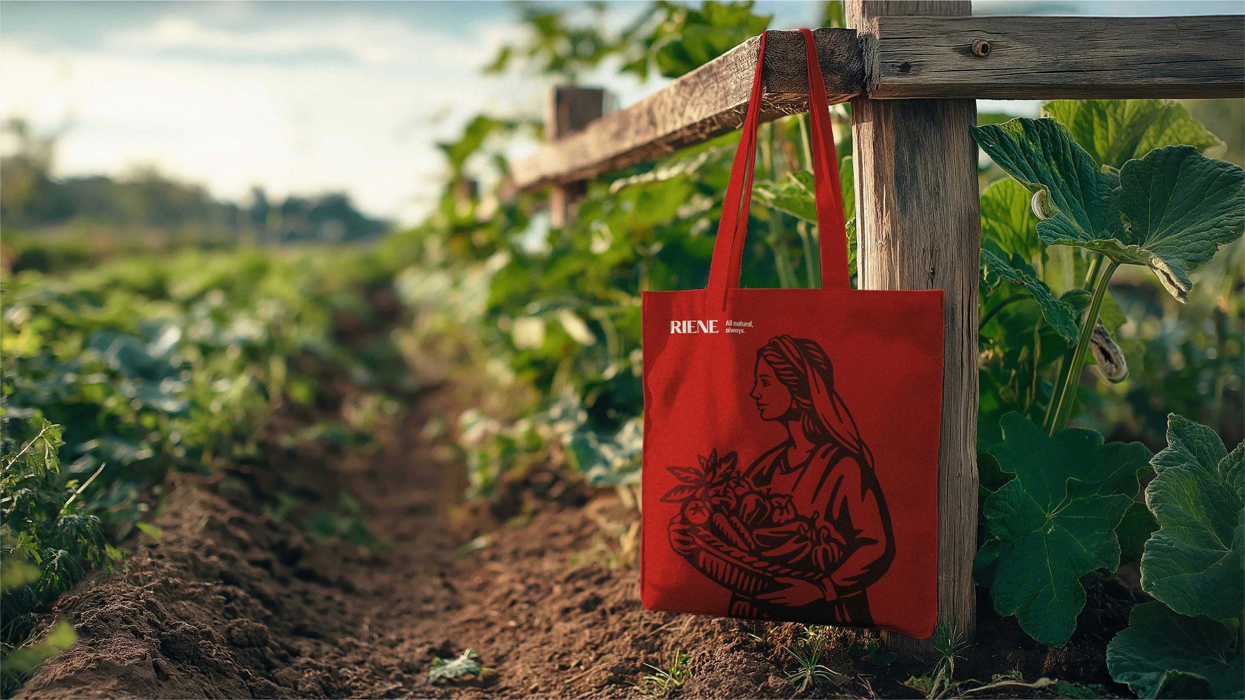
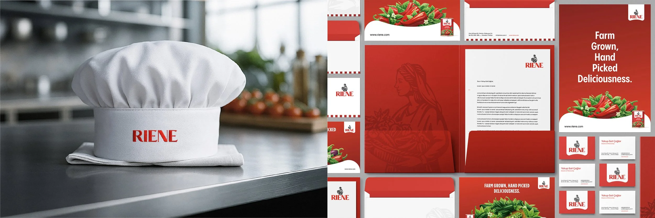
We partnered with Riene to build a brand identity that celebrates the beauty of simplicity, from nature’s generosity to the honest craft of cultivation. Rooted in authenticity, the identity system bridges the world between traditional farming heritage and modern dining culture. A visual language defined by bold reds, deep greens, and sunlit textures evokes freshness and vitality, while clean, contemporary layouts ensure every touchpoint feels as natural as the ingredients themselves. We also prepared brand illustrations to showcase the fresh produce, a preference over photography to imbue the brand with a stronger sense of craft and care.
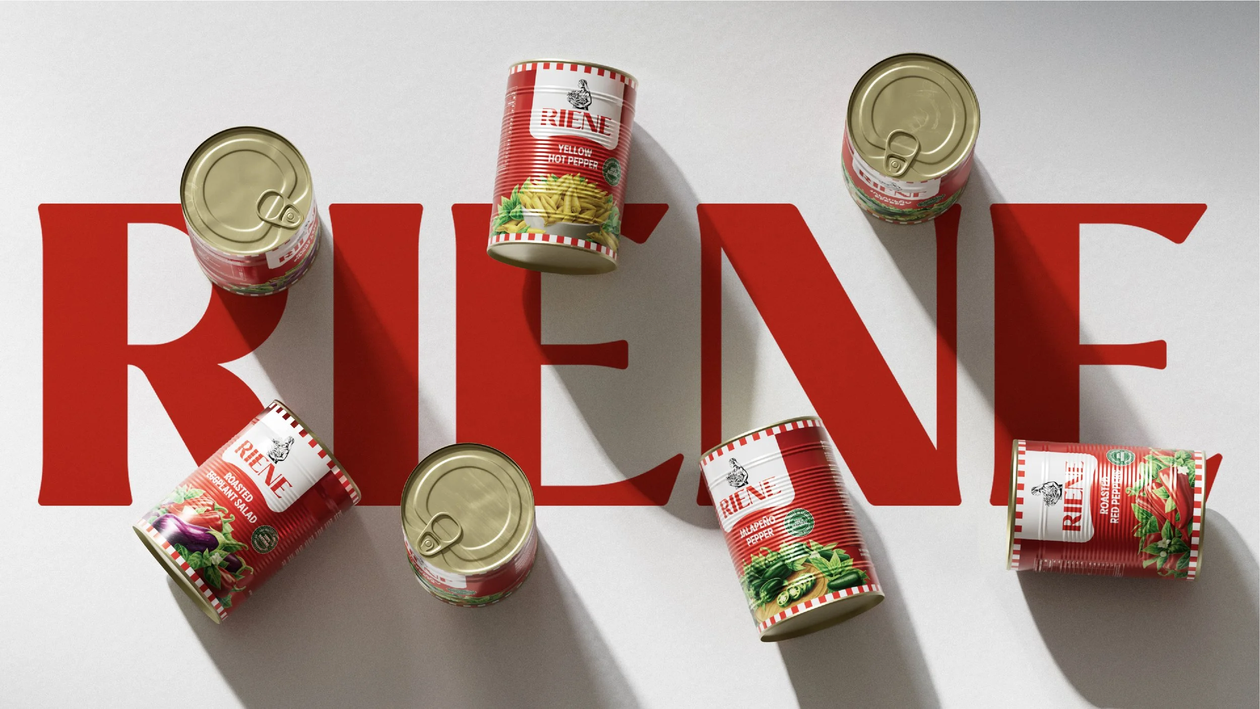
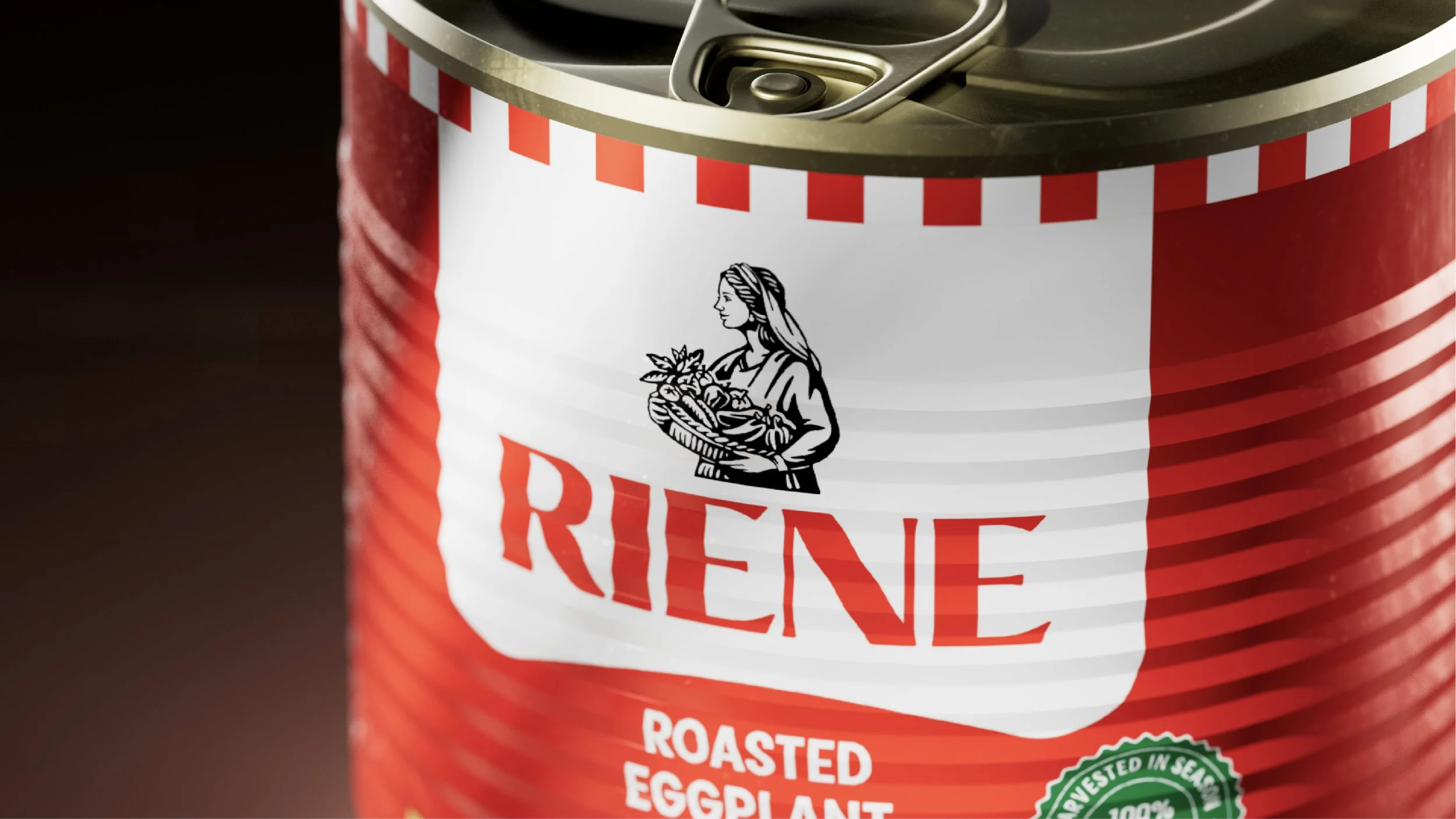
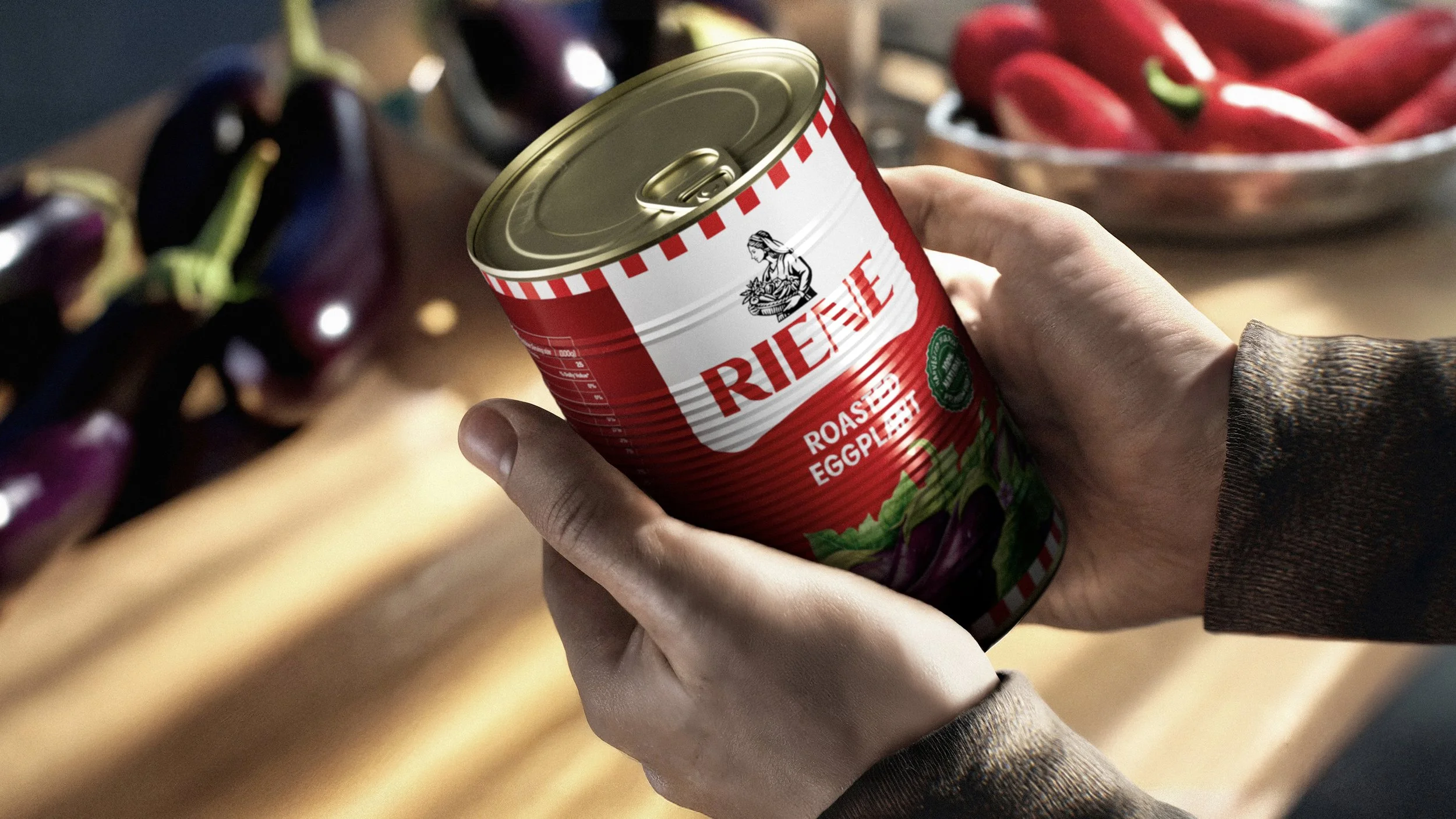
From packaging to printed materials, the Riene system was designed to communicate what the brand truly stands for: real flavor, real care, and real connection. Every jar, every label, every visual detail reflects the journey from farm to fork – proof that timeless authenticity can live beautifully in a modern world.
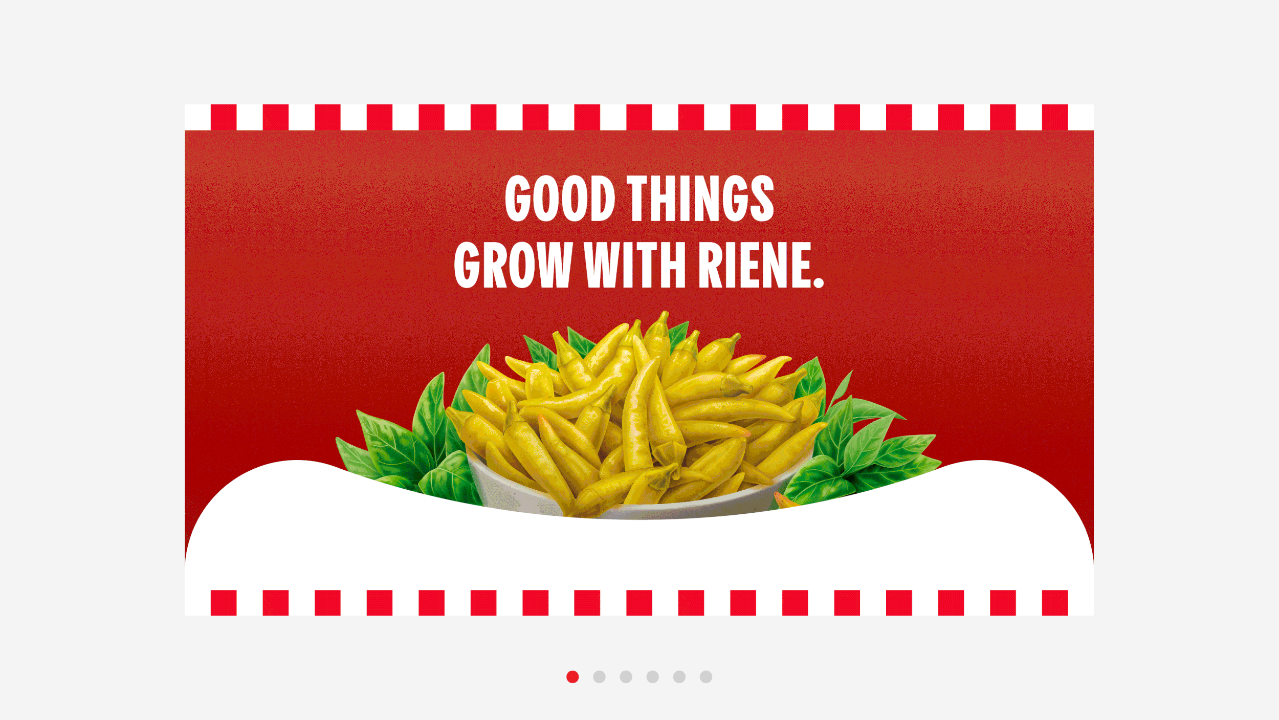
All natural, always
All credits on Bēhance
-
M M X X V